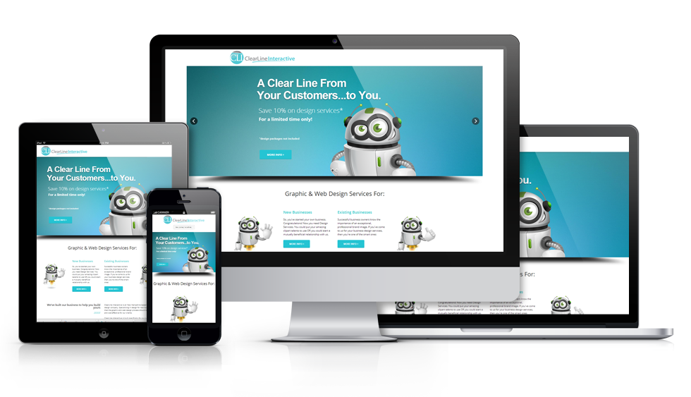
Long gone are the days that you would need multiple websites to accommodate all of the different devices offered in today’s booming technological world. Mobile friendly website design and development has come a long way since then and we now have access to some great new technology that allows you to have one website that if setup properly, works on smartphones, tablets, laptops and desktop computers.
It’s called Responsive Website Design, and we’re proud to offer it as a service to our customers.
 On April 21st 2015 Google announced that sites will no longer show up in mobile search results if they are not mobile ready. This is what they had to say about it
In February, we announced that the mobile-friendly update will boost the rankings of mobile-friendly pages — pages that are legible and usable on mobile devices — in mobile search results worldwide. (Conversely, pages designed for only large screens may see a significant decrease in rankings in mobile search results.)
Having a responsive website that is available on all devices is crucial to your business’s online presence. Mobile searching has grown exponentially in the past 10 years and shows no signs of slowing down. People are swapping their laptops for tablets, and their flip phones for smart phones. Times are changing and your website should too.
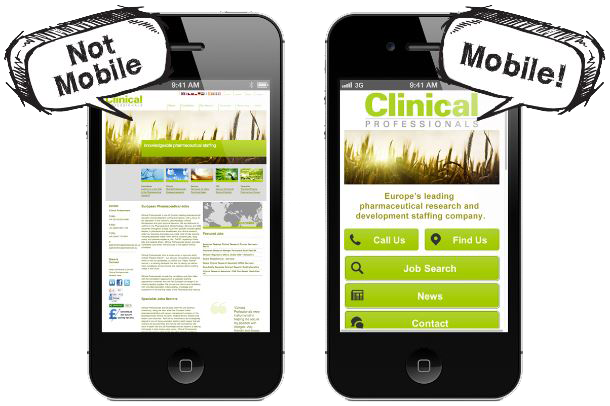
Responsive websites fix this problem by dynamically adjusting how your website appears based on the size of the screen it is being presented on. On smart phones your website takes on more of an app-like appearance while on your computer everything looks normal. On tablets, you’ll notice that your website is presented as a sort of hybrid of how it looks on your smart phone and website combined. The best way to demonstrate this responsive effect is really to just show you.
We recently completed a responsive website for one of our clients; New England Career Services. If you visit their website (new window will open for you) and adjust the width of your screen you’ll get a nice visual demonstration of how responsive website design works. Notice that as the website’s width shrinks, important information reorganizes and stacks on top of the other relevant information. Text and photos remain at a legible size and your navigation converts to a more user-friendly drop-down type system. All of these changes make for an improved user experience and will keep your clients happy no matter what device they are viewing your website on.
So how can you get a responsive website? We offer them as a standard option on most of our websites that we build for our clients.